
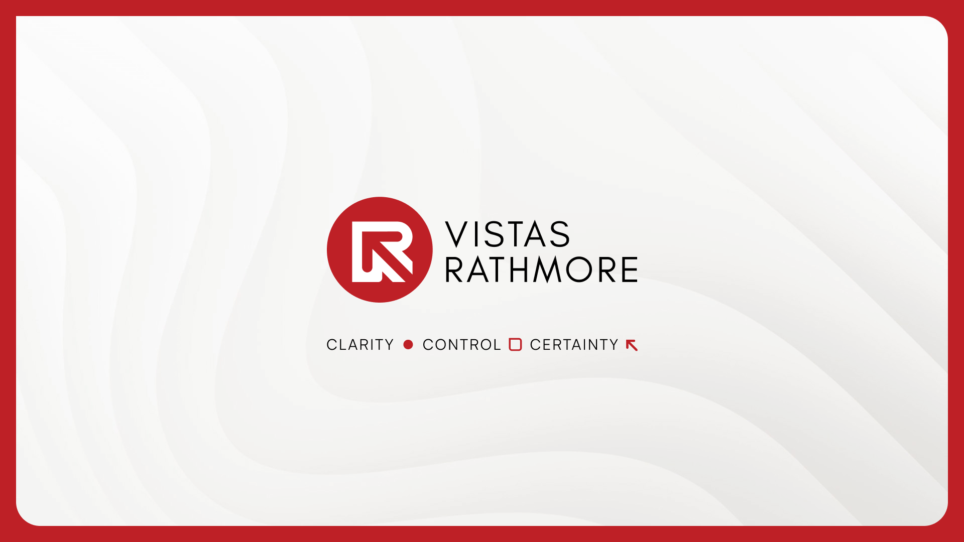
Vistas Rathmore — A Brand Built From a Single Mark
Rebranding from the ground up: building Vistas Rathmore's visual identity. At T-R-I, we were challenged to build a complete brand from a single existing mark — translating the geometry of a logo into an entire design system, visual language, and digital presence. Vistas Rathmore is a construction consultancy reimagining how complex projects are delivered across the GCC, born from the merger of decades of frontline project expertise with cutting-edge technology capabilities. Our role was to extract every visual principle from the logo itself — its colour, its forms, its underlying logic — and unfold them into a coherent identity that could operate at scale. This case study reveals how we shaped Vistas Rathmore's brand from strategy to deployment — from design system and asset library to a fully built Webflow website — to express clarity, control, and certainty across every touchpoint. A motion-first identity built for an industry that has rarely seen one done this way.

Case Study: Tachyon Impact Solutions
Designing the invisible: building Tachyon’s brand identity.
At T-R-I, we were challenged to visualize what technology alone could never show — the hidden authenticity within every physical object. Tachyon Impact Solutions pioneers geometric-spectral scanning to create unique digital twins, enabling object-level verification without tags, codes, or markers. Our role was to translate this breakthrough science into a cohesive brand identity system that feels as intelligent and transformative as the technology itself.
This case study reveals how we shaped Tachyon’s visual communication strategy — from logo and motion design to interaction language — to express precision, transparency, and trust. A seamless blend of technology branding, data visualization, and design storytelling that turns complex science into an elegant experience of truth revealed.