
Opening FunnelFuel_Rebrand_v9_no_really.key…
TRI Presenter
2.8.0
Starting with the mark
The original wordmark was two words locked together in a heavy sans, black on white, with a single graphic quirk in the "F". We italicised the wordmark to introduce forward motion, then rebuilt each "F" out of stacked spheres in deep purple, indigo and gold.
The result still reads instantly as FunnelFuel, which mattered a great deal to a company with existing recognition, but it now has a point of view.
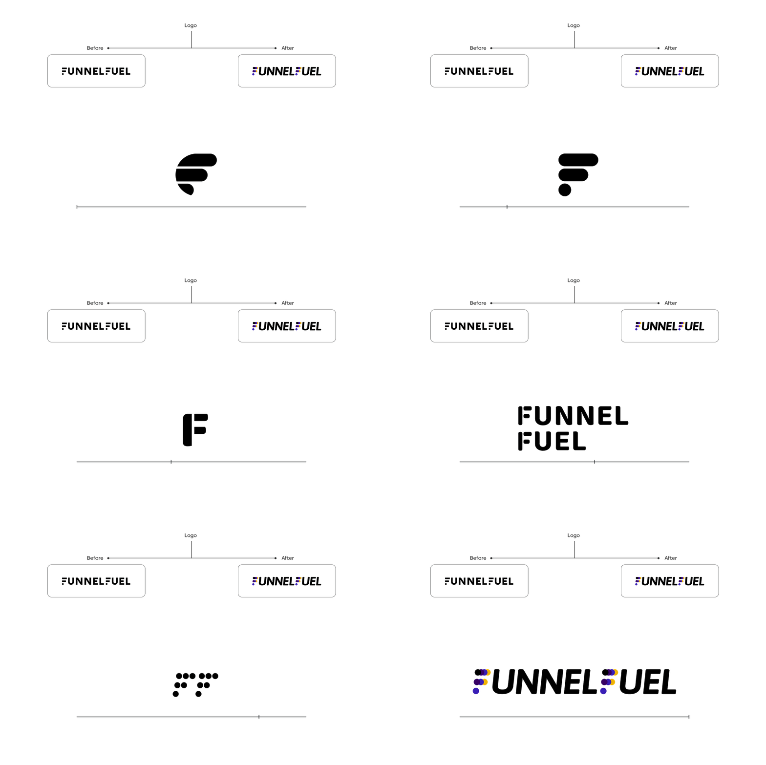 the wordmark, before and after
The conceptual core
Three rows of overlapping circles, compressed at the top and progressively spaced below, describing the B2B marketing supply chain: many stakeholders, many transactions, many data interconnections, resolving into a single entity in the market. It gave us a symbol that explains the business if you ask it to, and simply looks good if you don't.
Because the spheres are modular, they became the visual grammar for everything downstream. Bullet points, section markers, icon containers, chart nodes, decorative accents. One idea, endlessly reusable.
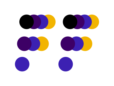
Building the system, not just the logo
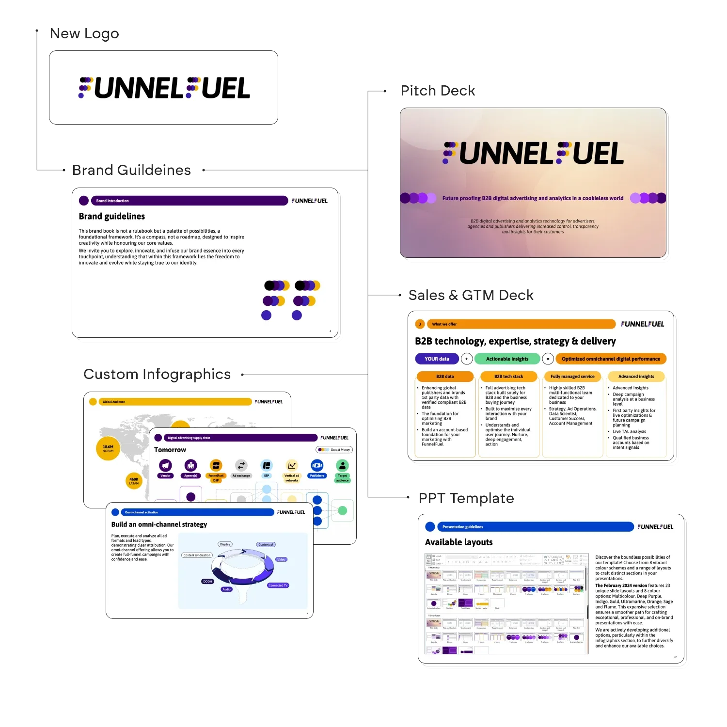 five deliverables, feeding each other
The logo, a full brand guidelines document, a pitch deck for investors, a sales and go-to-market deck, and a custom infographic library, all resting on a PowerPoint template that would let the team produce the next thousand slides without our involvement.
That last point drove a lot of decisions. A rebrand that only works while the designers are in the room is not a rebrand, it is a project. We wanted FunnelFuel to be able to outgrow us.
The guidelines
Inside: brand personality and values as a sphere diagram (Transparency, Speed, Control, Change Catalysts, Accountability, Actionable, and a black sphere labelled "No BS"), the colour palette with full HEX, RGB and CMYK breakdowns, typography in ASAP with usage notes per weight, iconography rules, sub-mark construction with measured clearances, and a don'ts page.
The don'ts page is the one we would defend hardest. Six examples of the logo being distorted, crowded, recoloured, made transparent, and dropped onto a busy background. The least glamorous spread in the document and the one most likely to prevent damage.
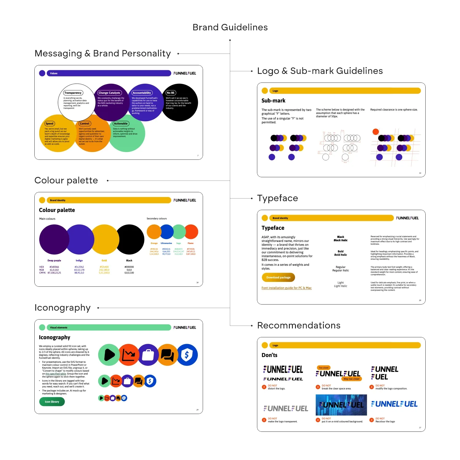 the guidelines
The decks
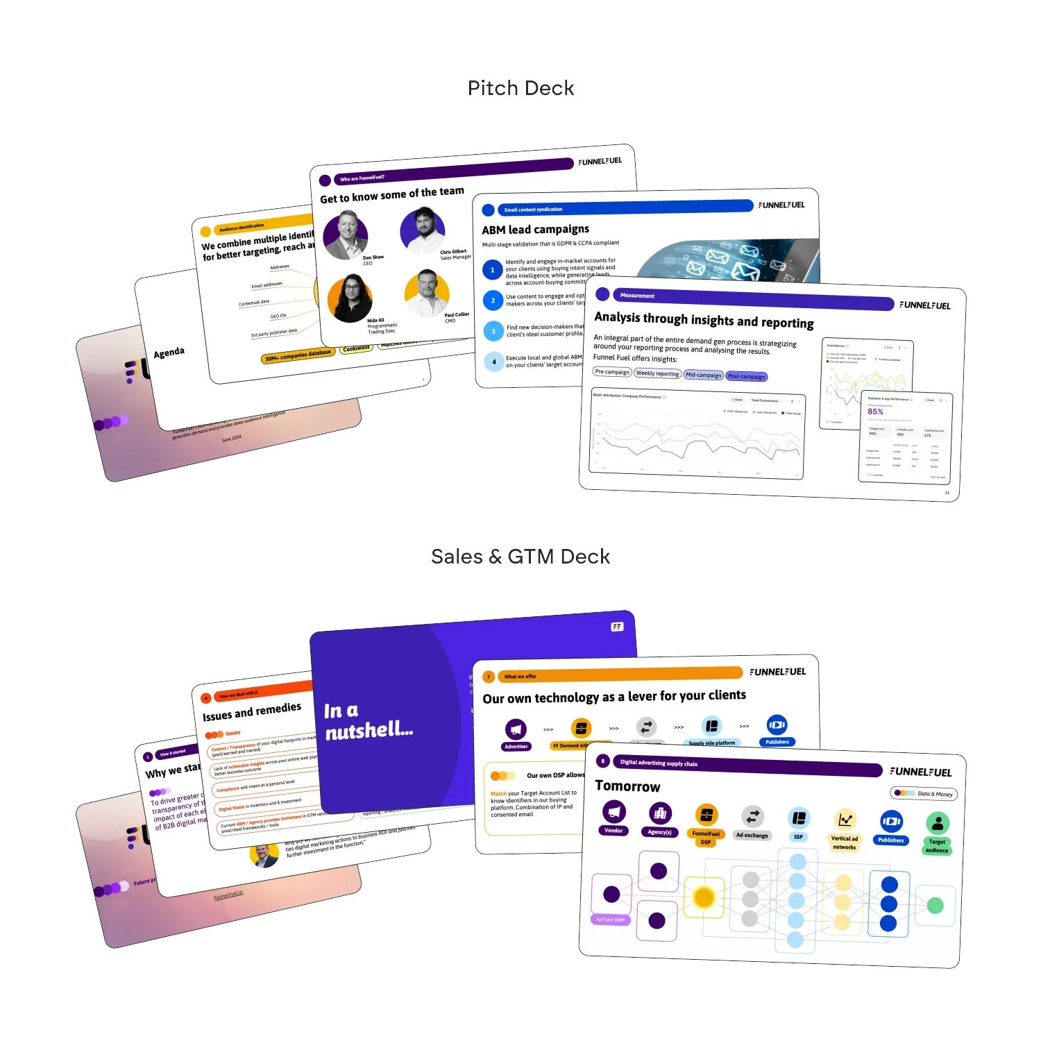 pitch deck & sales / GTM deck
The pitch deck runs on the gradient cover, team pages and measurement dashboards, while the sales and GTM deck carries the heavier explanatory load: issues and remedies, the technology stack, and the supply chain diagram that maps vendor to audience across a field of spheres.
The decks were where the new system had to prove it could argue a case, not just look tidy.
The template that had to survive contact with reality
We built 23 unique slide layouts across 8 colour schemes: multicolour, deep purple, indigo, gold, ultramarine, orange, sage and flame. Number placeholders that render as empty spheres if left blank. Icon placeholders with suggested colour pairings baked in. Image placeholders pre-cropped to brand ratios. We even added a note explaining that leftover instruction text disappears in presentation mode, because we had watched enough decks go out with "icon here" still visible on slide four.
Alongside the template: custom infographics for the recurring stories the sales team told: the digital advertising supply chain, global audience reach, the omni-channel activation funnel. Standardising them removed a chunk of repeated work and, more importantly, made the company sound like one company.
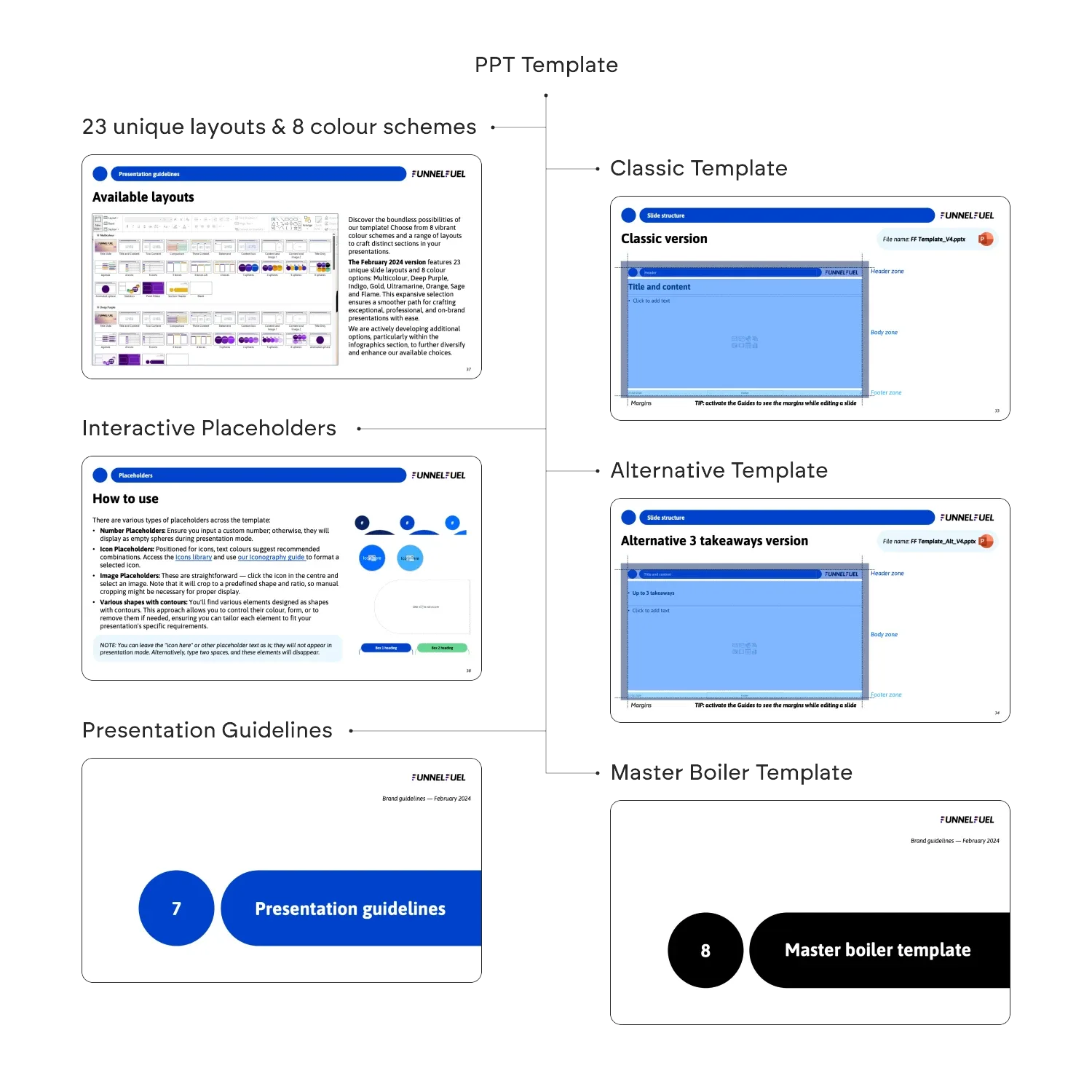 the template system
What we took from it
A rebrand's real deliverable is not the logo, it is the reduction in daily decisions. Every layout we defined, every colour scheme we pre-built, every placeholder we constrained, removed a moment where someone would otherwise have had to guess. Multiply that across a team growing five times over and the guessing is the thing that would have broken the brand.
© 2026 TRI NET LLC
Version 2.8.0 · "Open Recent"
All case study images are actual project materials. The autosave indicator is decorative but emotionally load-bearing. © 2026 TRI NET LLC.