
Opening ReadingHabits_Infographics_v5.key…
TRI Presenter
2.8.0
Finding the narrative before finding the visuals
We opened wide, at the scale of two centuries, because the single most surprising fact in the entire dataset is also the most human one. Framing this as a journey from 1 in 10 to almost 9 in 10 readers gave the whole piece its emotional starting point. It turns a percentage into a before-and-after.
Everything that follows, every complaint about declining attention spans or lapsed young readers, sits inside that context. We wanted people to arrive at the modern data already feeling how improbable the present is.
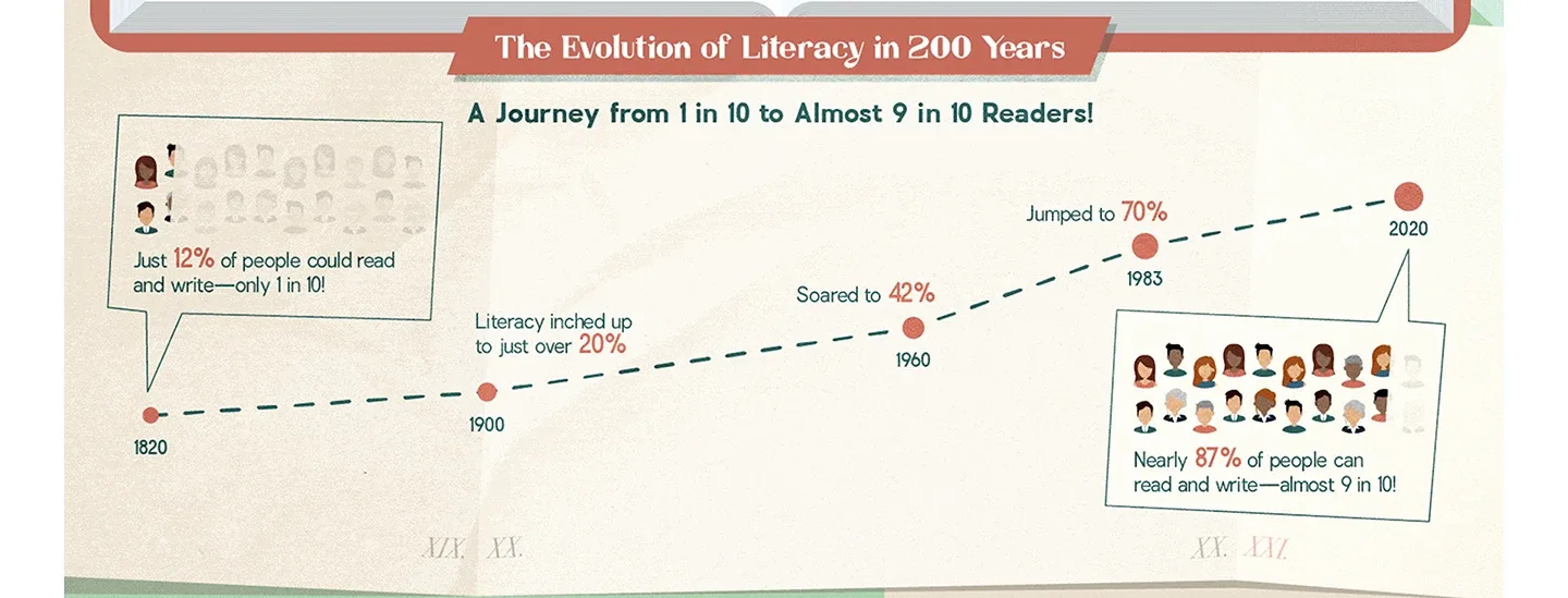 the opening: 200 years of literacy
Who actually produces all these books?
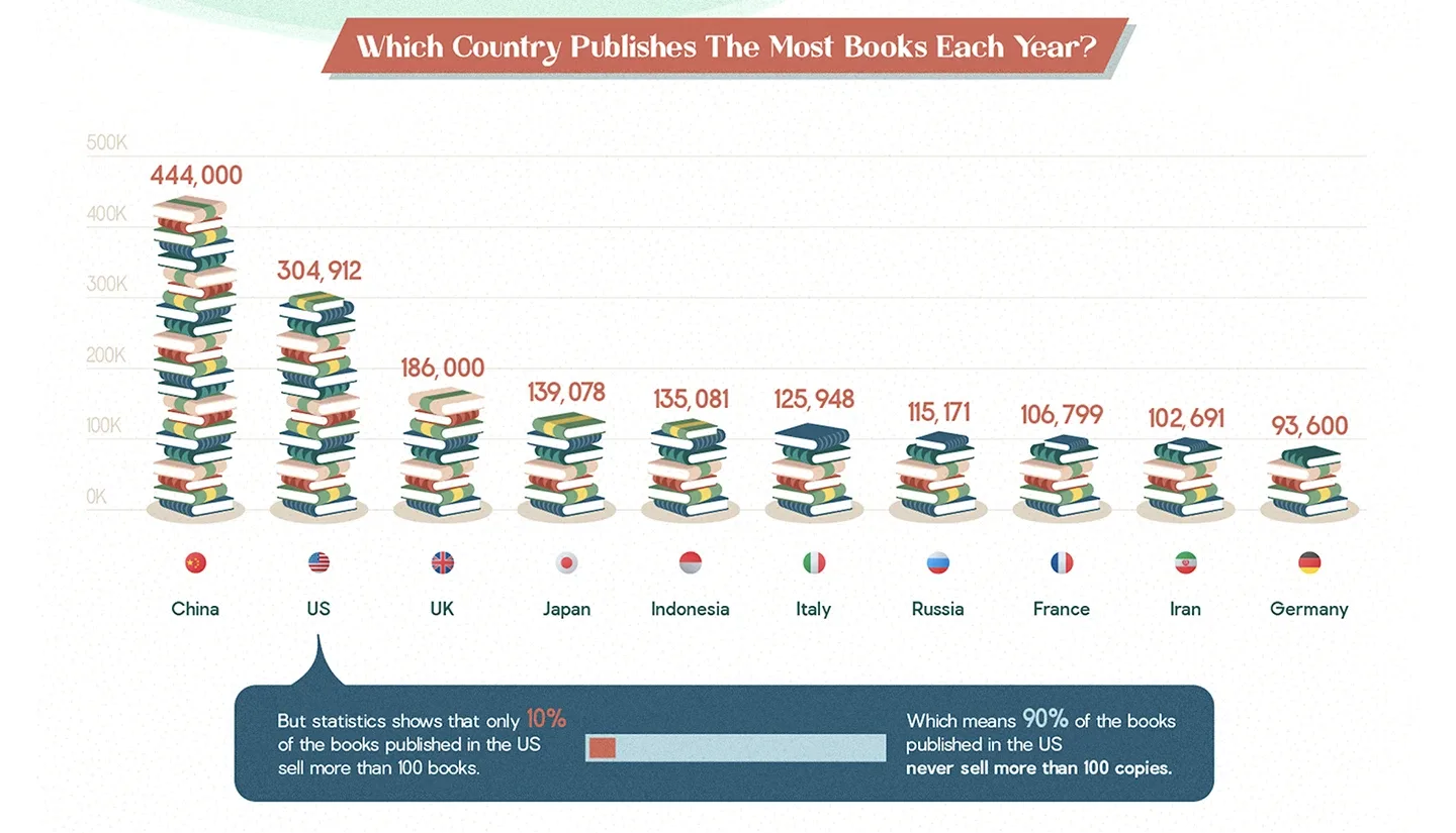 bars, built out of stacked books
Building the bars out of stacked books did two things at once: it made the comparison physical, and it made the scale funny.
Then we undercut the whole thing with the footnote about 90% of US books never selling more than 100 copies, which is the kind of detail that stops a scroll.
Handling density · The United States panel
There are four separate reading-frequency statistics in the top left, and in the source material they lived in a table. We turned them into rows of book spines, so the comparison between the average of 12 and the median of 4 is legible in about half a second, before you've read a word.
The proficiency figures at the bottom sit in their own band, deliberately separated, because they carry a different and heavier meaning than the habit data above them.
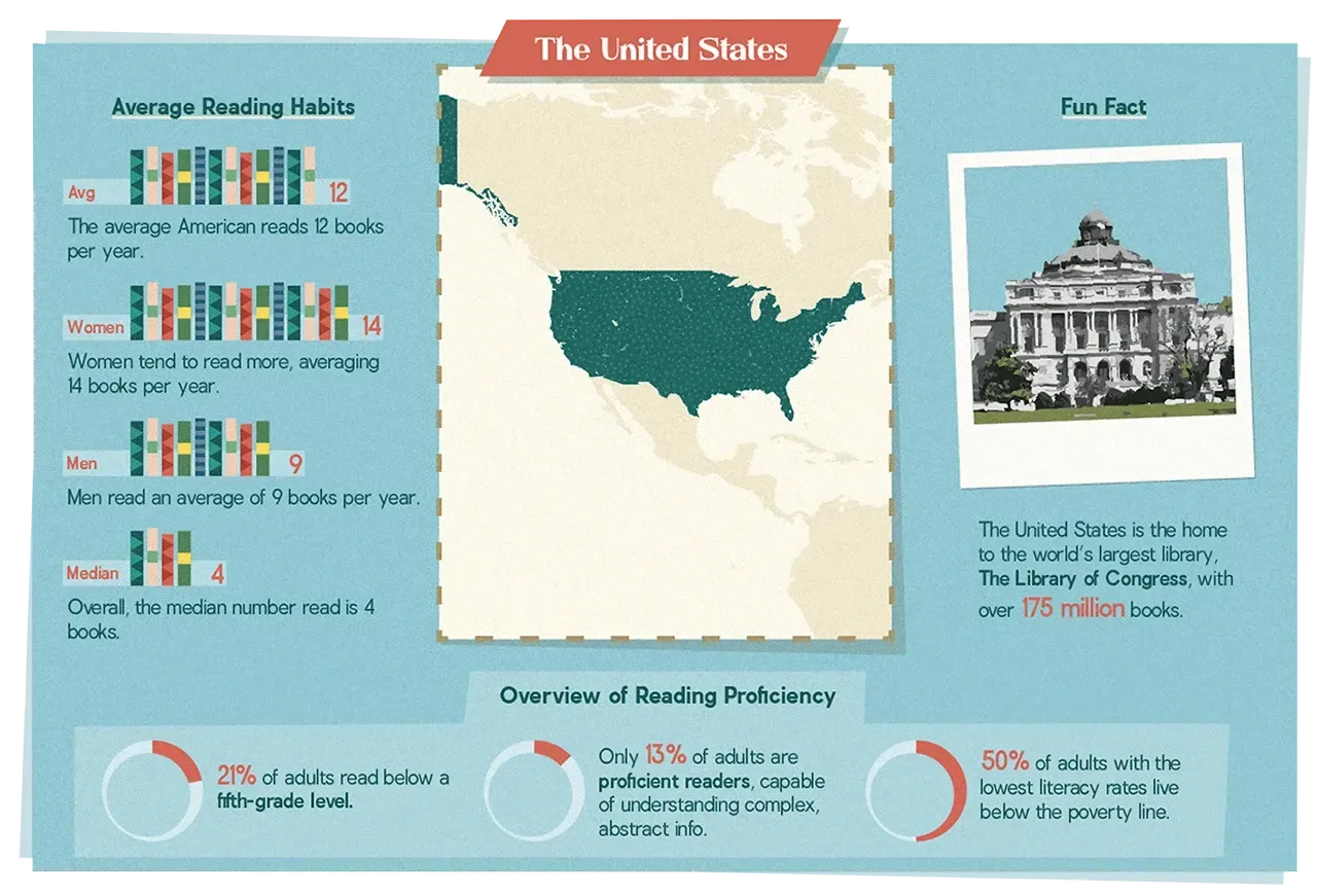 the united states panel
The test case for hierarchy · Europe
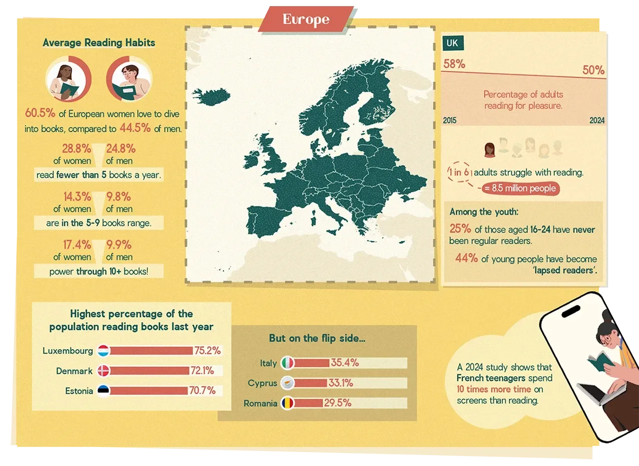 the europe panel
Gendered reading habits on the left, a country-level spotlight in the center, and the ranked comparison along the bottom. The wedge shapes between the women and men percentages let us show a gap without needing a legend or a second chart.
And we gave the UK's declining pleasure-reading line its own card, because a downward slope deserves room to breathe rather than being buried in a list.
A shift in story · Latin America
The literacy rings stay minimal and quiet, freeing space for the Gabriel García Márquez spotlight and the two-page book spread on Mexican and Argentinian book markets.
Details like Buenos Aires holding the world's highest concentration of bookstores per capita are the sort of fact people repeat at dinner. We designed the panel so that fact would be easy to find and hard to forget.
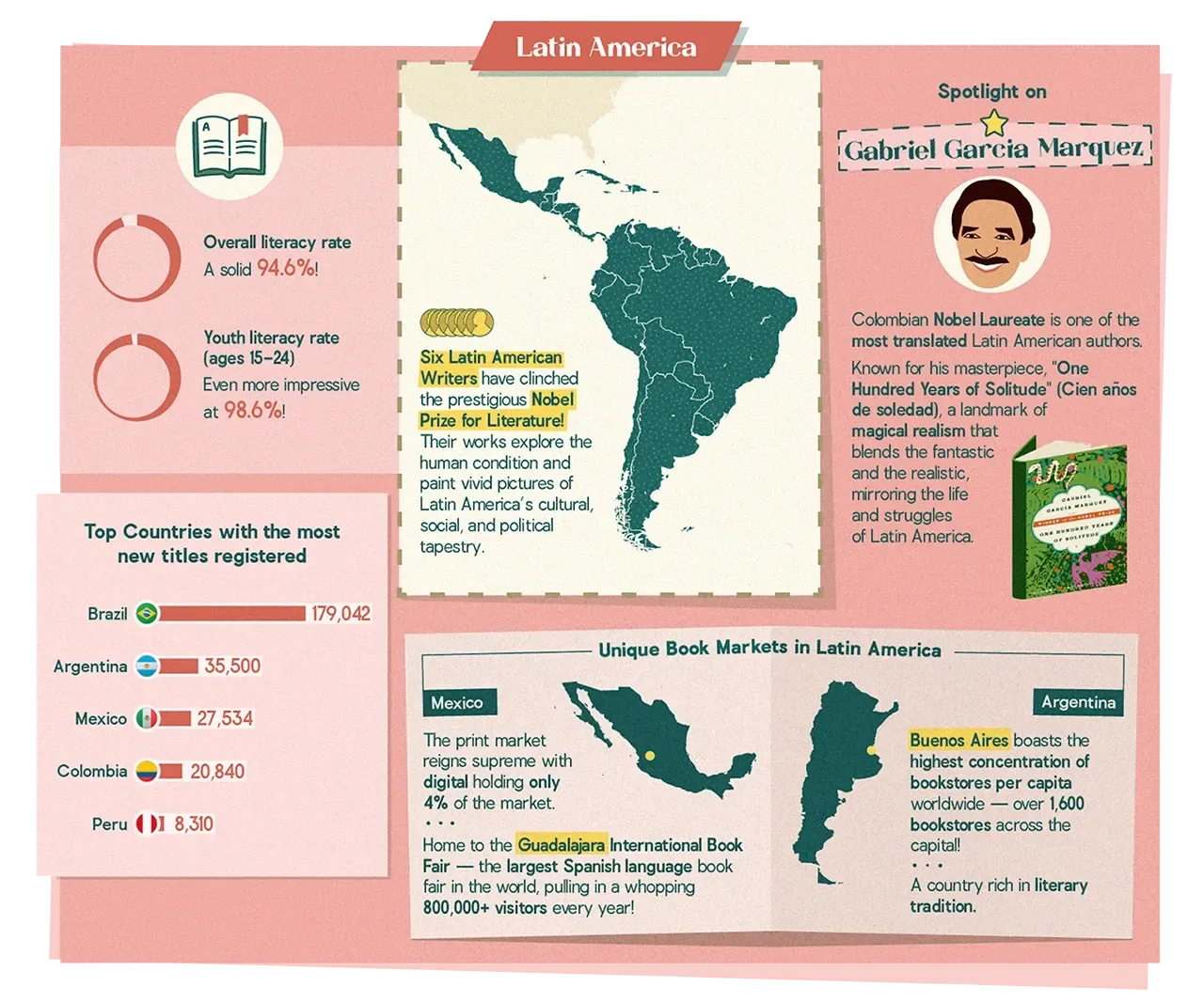 the latin america panel
The closing turn · Self-publishing
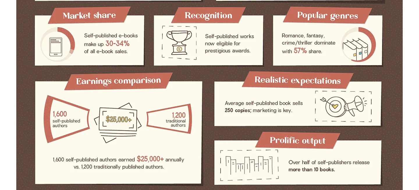 the self-publishing panel
We closed the series with self-publishing, using a dark background to signal a shift in register. This section is about the industry rather than the reader.
The earnings comparison, 1,600 self-published authors clearing $25,000 against 1,200 traditionally published ones, was the piece we most wanted to land, so it got the largest card and the most literal illustration.
What we learned
The single biggest improvement over the source material wasn't a color choice or a typeface, it was deciding what came first. And illustrating a publishing ranking as a stack of wobbling books doesn't dilute the data, it buys attention that a conventional chart would never have earned. The result is a series that people finish, screenshot, and pass along.
© 2026 TRI NET LLC
Version 2.8.0 · "Open Recent"
All case study images are actual project materials. The autosave indicator is decorative but emotionally load-bearing. © 2026 TRI NET LLC.