Opening Tachyon_Case_Study_v4_FINAL.key…
TRI Presenter
2.8.0
Product authentication, reimagined
Tachyon Impact Solutions uses geometric-spectral scanning to create unique digital twins for physical objects: no tags, no markers, just the object itself. A cut diamond can be traced back to its rough stone. A modified part remains identifiable. Stolen or counterfeit goods are instantly recognized.
We're excited to have built the complete brand identity behind the technology that will eliminate $1.79 trillion in counterfeit goods by 2030 (Source), and eventually put authentication power in everyone's pocket.
Tachyon Impact Solutions Website → the live website
The logo · The form: geometric-spectral DNA
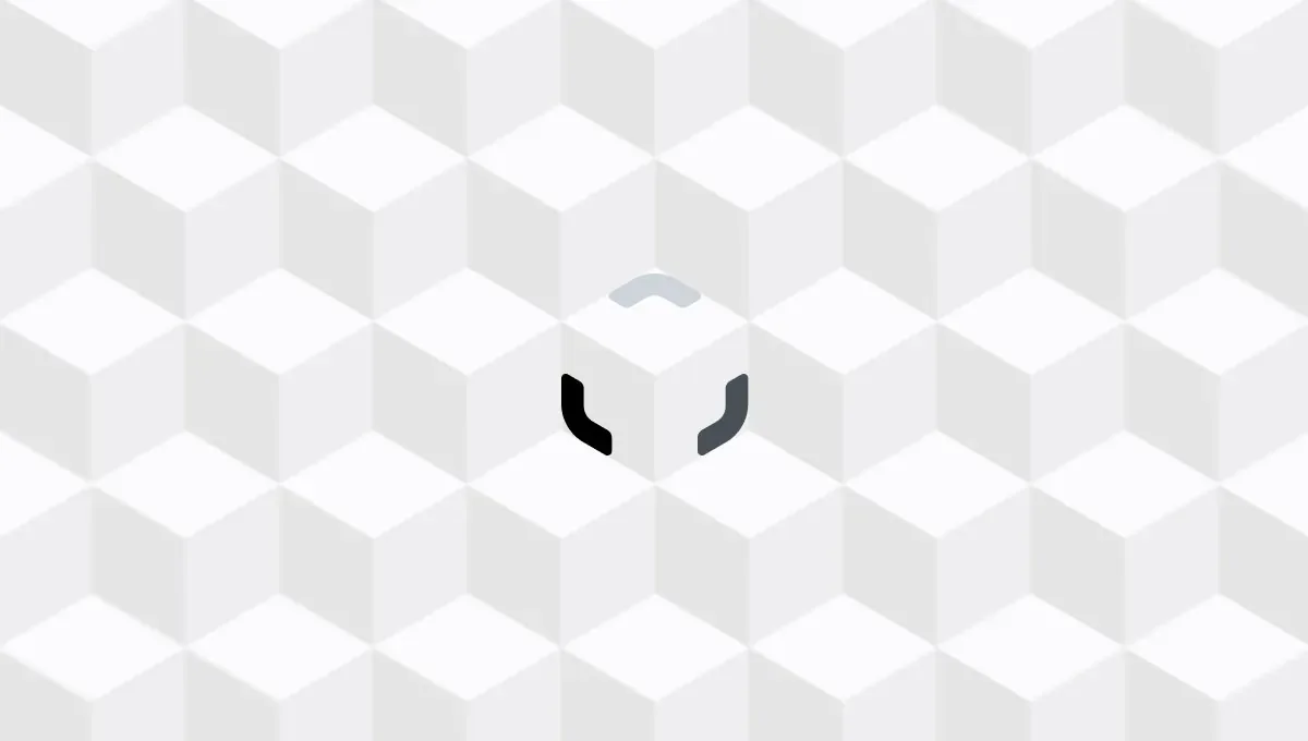 logo architecture
The logo represents 3D-capturing frames cut from a cube. Each element represents one visible cubic face, because a cube has six faces but only three are visible at once. This mirrors Tachyon's core principle: there's always hidden details, invisible evidence of authenticity waiting to be revealed beneath the surface.
These three elements work like geometric-spectral DNA, combining to create unique identification, just like genetic triplets. They create the frame of reference for establishing certainty.
The logo · The transformation
Like an iris or camera shutter: that moment of revelation when truth is exposed. The transformation tells the complete authentication story.
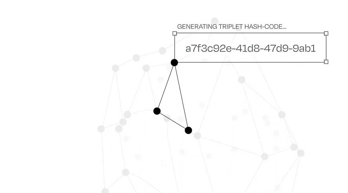
This three-part structure also directly mirrors the technology itself: Tachyon's "geometric-spectral triplets", tiny clusters of unique reference points that authenticate each object.
 the actual logo animation
The color · A spectrum of certainty
From surface to depth. From light to certainty.
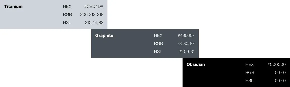 spectrum of certainty
Brand visual identity · The capture frame principle
Across the website, every element sits inside hairline light-gray capture frames. Buttons, images, text blocks, feature cards: all contained within these geometric boundaries. It's not just visual consistency, it's a constant reminder: every object can be verified, every element is captured.
The frames expand across product photography, literally wrapping around objects as if humans are scanning them in real-time. A diamond. A handbag. A sculpture. Each one being held within the authentication system.
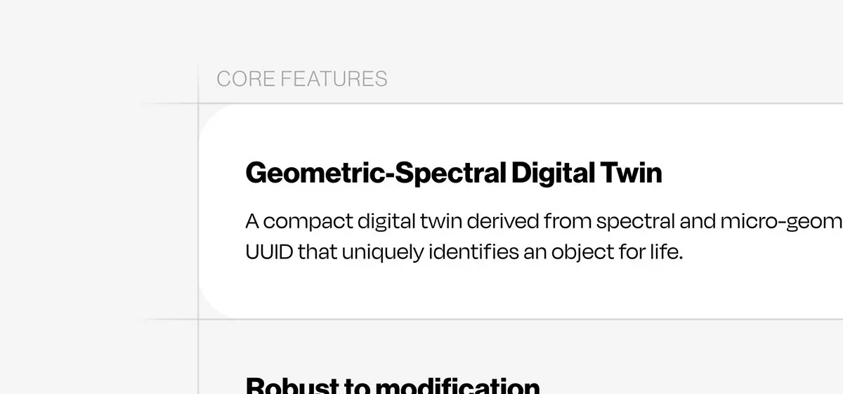 website
Brand visual identity · The morphic identity
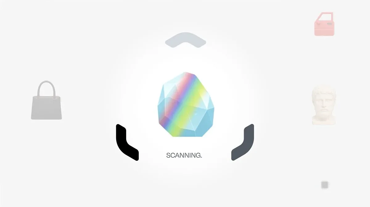 brand launch video
Earlier we showed how the logo transforms from expanded to condensed. That morphing principle became part of the entire brand behavior. Website interactions don't just fade or slide: they morph. Content cards in the Business Benefits section shift and transform as you scroll. The logo itself breathes, opening and closing like an aperture ready to capture the next object.
Brand launch video on YouTube →Brand visual identity · The object library
These aren't stock illustrations: they're custom-built assets that live within the capture frames. Each one demonstrates what Tachyon does: peak beneath the surface to reveal authentic structure.
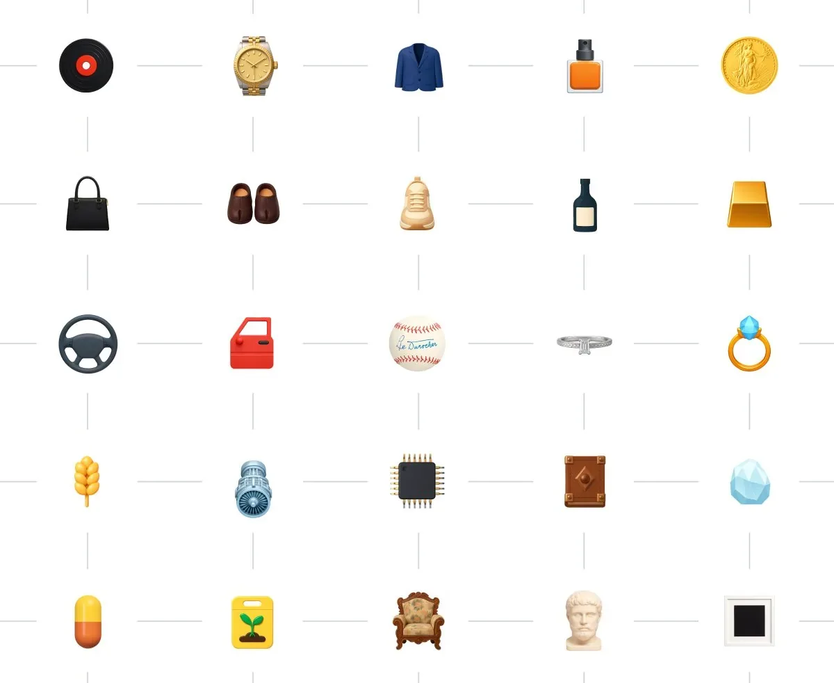 object library
From whiteboard to world-ready · The challenge
Tachyon's technology is groundbreaking, which meant no category conventions, no established design language. Just complex science that needed to become instantly understandable. And here's the thing: it's B2B today, but B2C in 2-3 years. The brand has to work in a boardroom now and in someone's pocket later.
We made sure we weren't just decorating complexity: we were translating it. Here's Max Rady (CTO and co-founder) trying to explain to us how the triplets hash generation works.
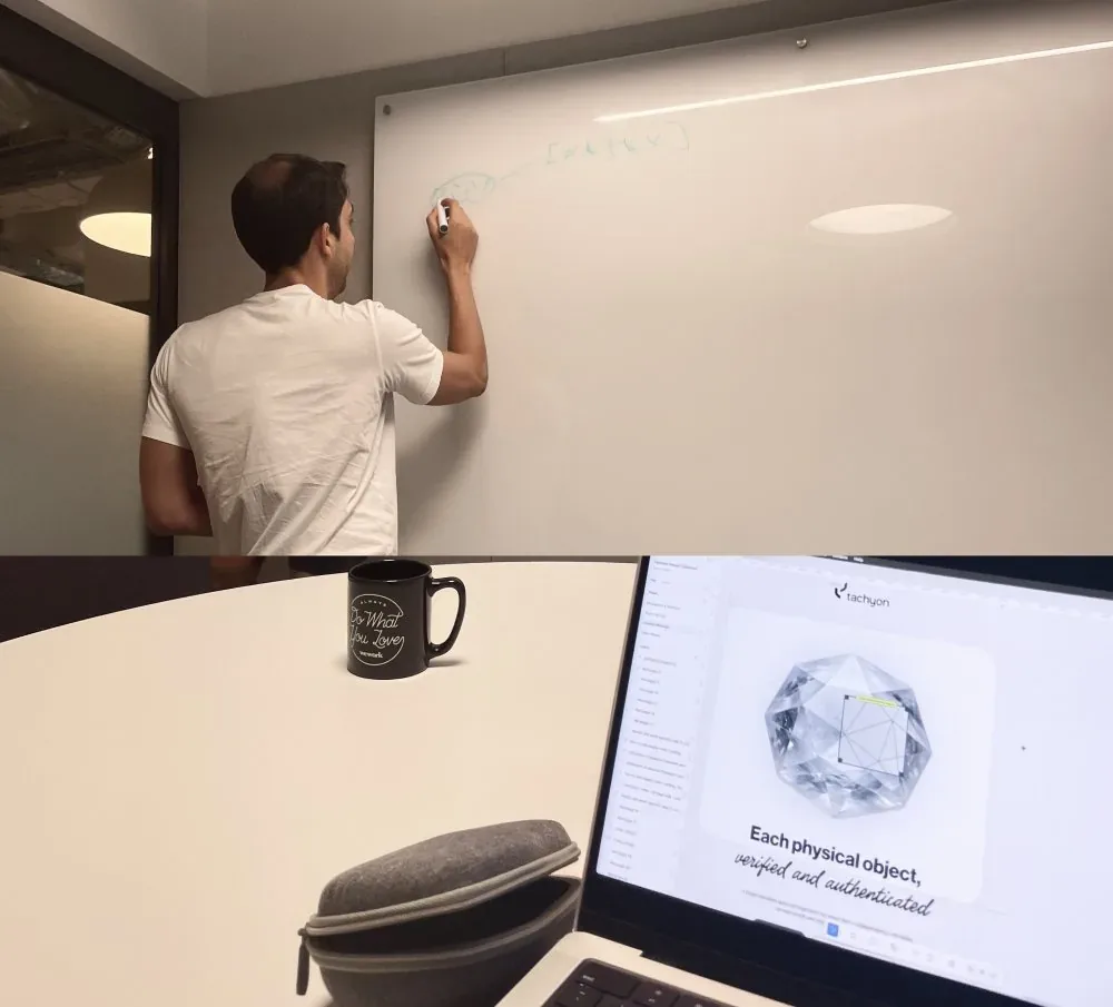 Max Rady explaining his technology in details
From whiteboard to world-ready · The process
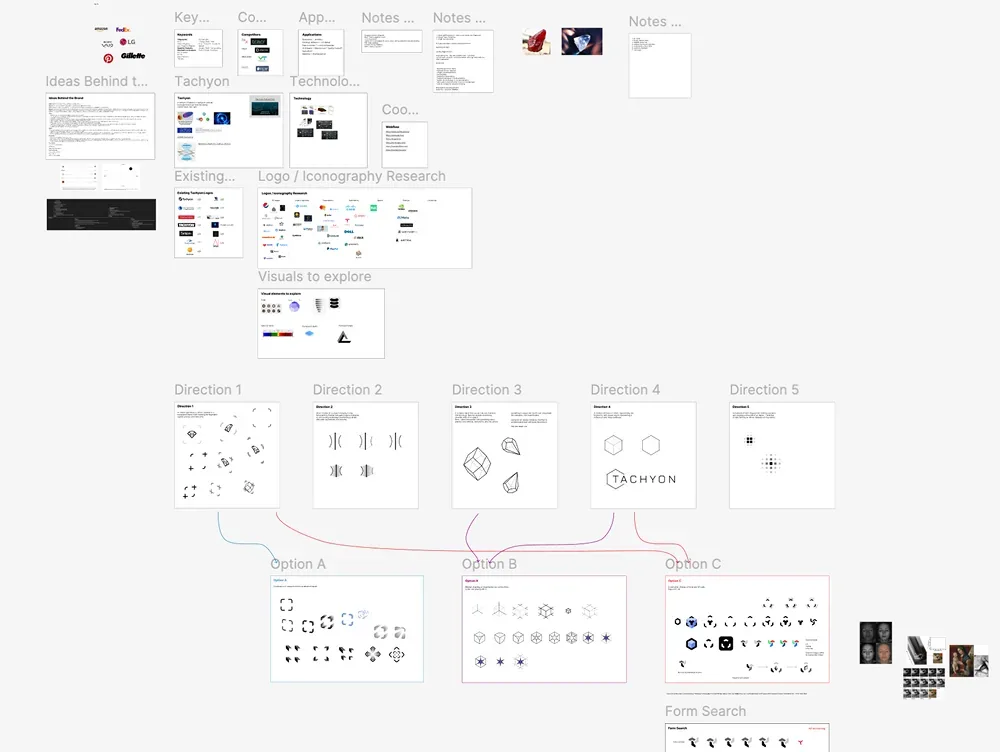
We developed five distinct visual directions. Presented them. Defended them. Killed three. The remaining two had something, but neither was complete.
So we did something unexpected: we merged them.
From whiteboard to world-ready · The details
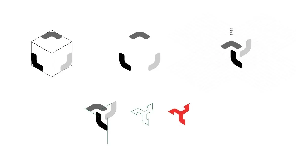 negative space, cut into letterforms
We used it to cut into the letterforms, making the typography inseparable from the mark itself.
But we hit a problem. From certain angles, it looked like a boomerang. And boomerangs... come back. Not exactly the message for authentication technology. Back to the drawing board.
From whiteboard to world-ready · The solution
We kept refining the geometry until the frames felt liquid: morphic, not fixed. A logo that transitions, that breathes, that's ready to capture objects at any given moment.
The expanded frames scan. The condensed form secures. Everything in between is transformation: physical to digital, uncertain to proven, hidden to revealed.
It took longer than we planned. More rounds than we quoted. But sometimes that's just how it goes when you're figuring things out as you build them.
 approved main logo
Landing page · The hero interaction
Land on the homepage and you get an easter egg: move a see-through frame across the surface and it reveals the wireframe beneath, showing the micro-geometry that makes each stone unique.
It's a simple interaction, but it does something important: it makes you feel what Tachyon does. You're not reading about authentication. You're authenticating.
Try it out yourself →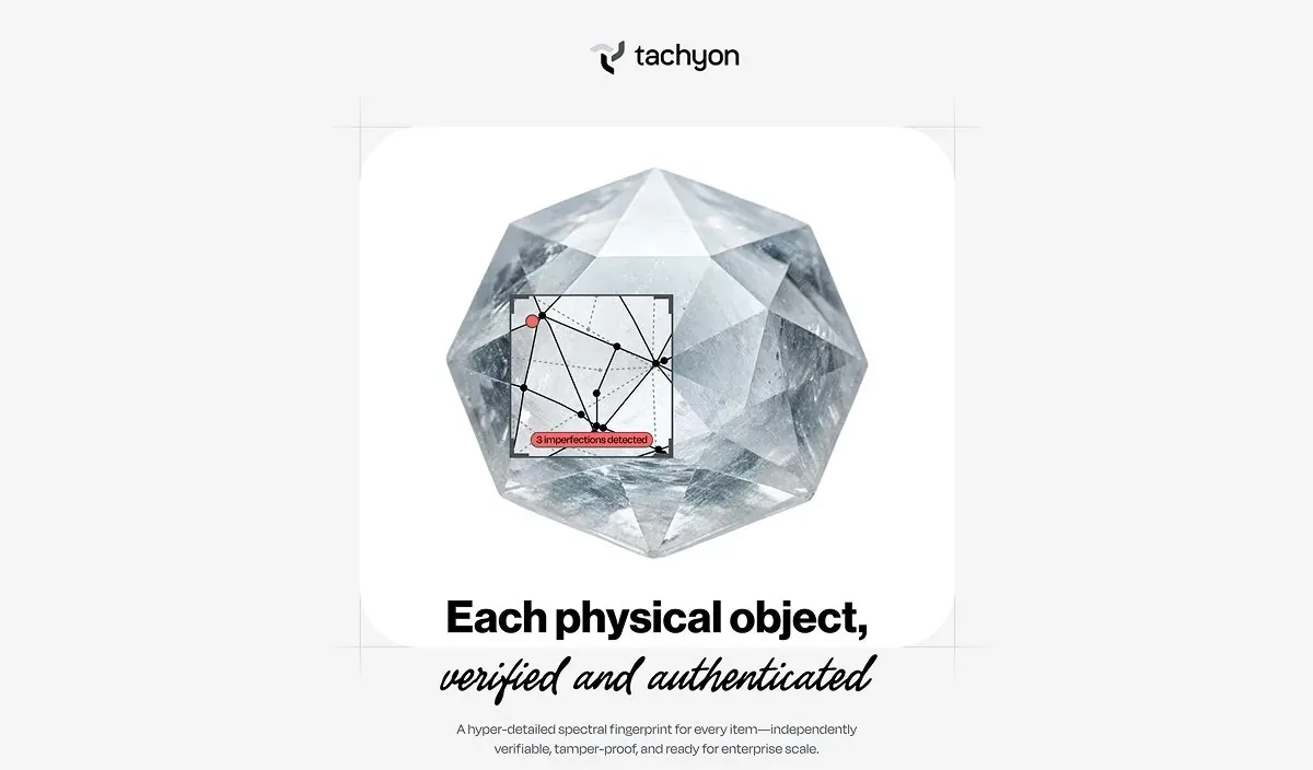 website hero interaction
Landing page · The morphing system & design language
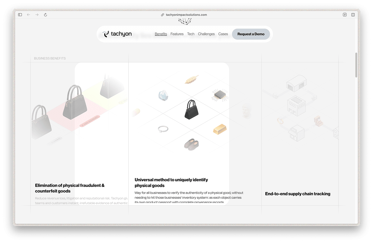
Content cards morph and shift as you scroll: the brand's "morphness" principle in action. Liquid. Flexible. Always ready to capture the next object.
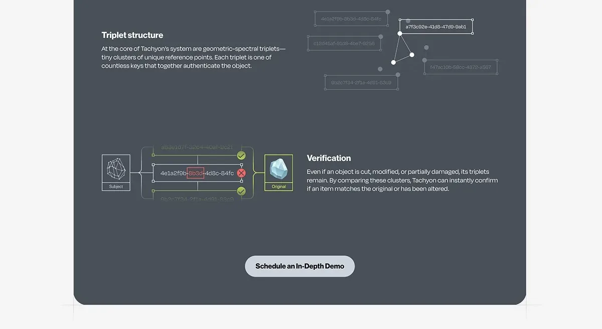
Almost everything sits inside hairline capture frames, in near-pure grayscale. But the objects? They shine. They pop. They demand attention.
Landing page · The details & the principle
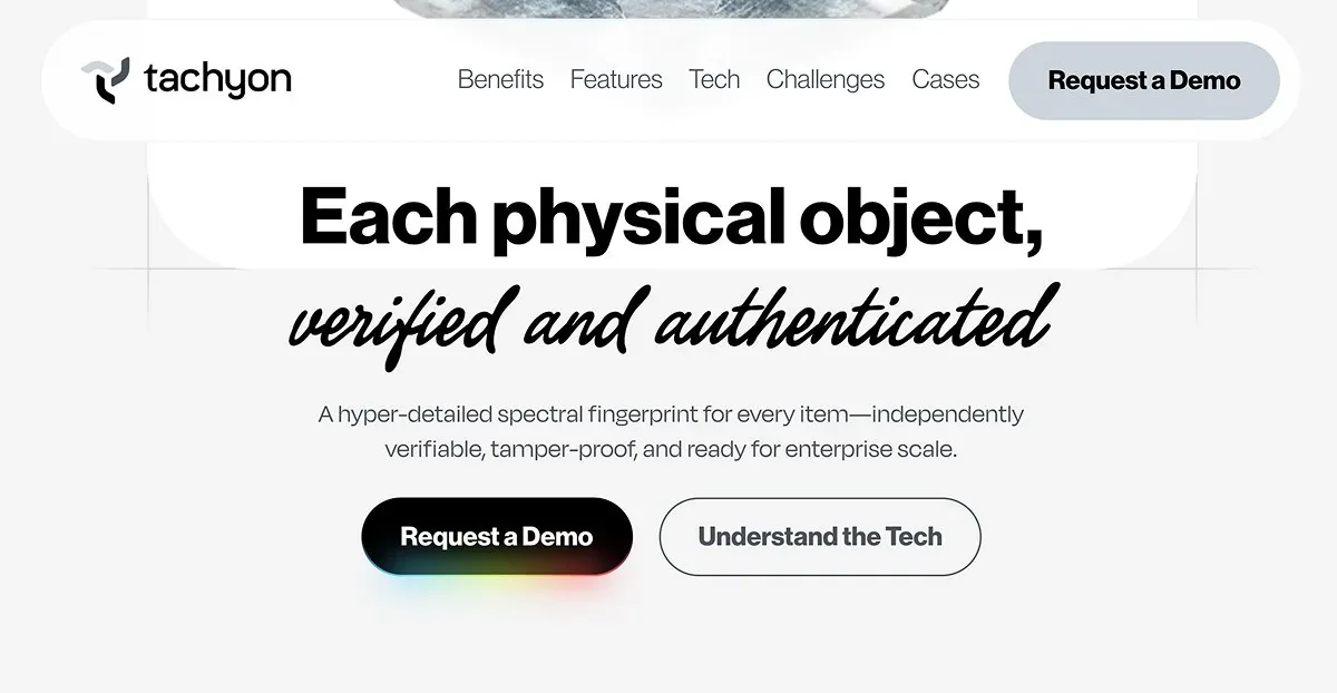 website hero section
Even the CTA buttons carry the story forward. Hover over them and you'll see a moving spectral gradient: a subtle nod to the spectral scanning that powers the whole system. Every interaction maps back to how authentication works.
Kudos to Grant Boufford from CMD-K Design for helping us make it even better than we imagined.
Visit and explore →Launch video · The decisions, 1 of 3
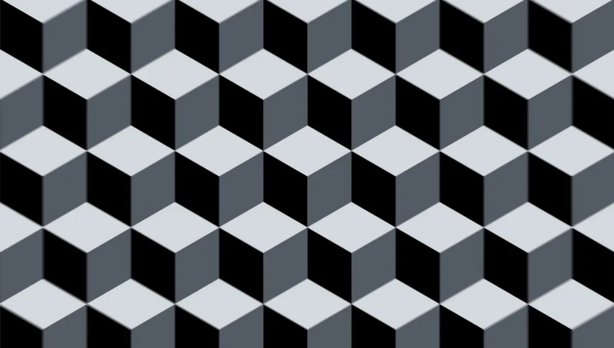
We open with endless isometric cubes: visual shorthand for "this works for everything." A global database of every physical object.
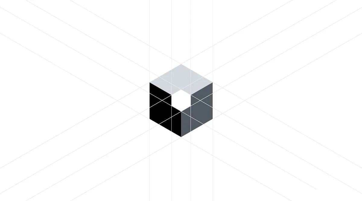
Hairline frames slice through the cube and isolate three elements: a logo reveal that also demonstrates the scanning process.
Launch video · The decisions, 2 of 3
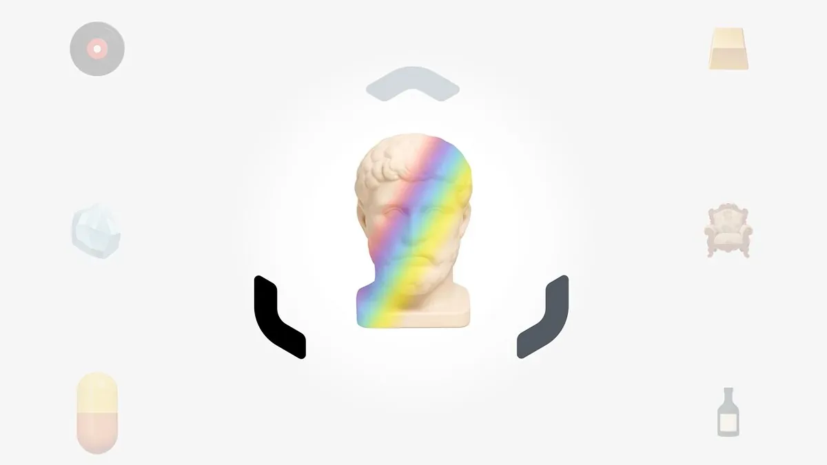
Objects from different industries at different price points. The morphing logo shifts from closed to open: the aperture principle, the technology activating.
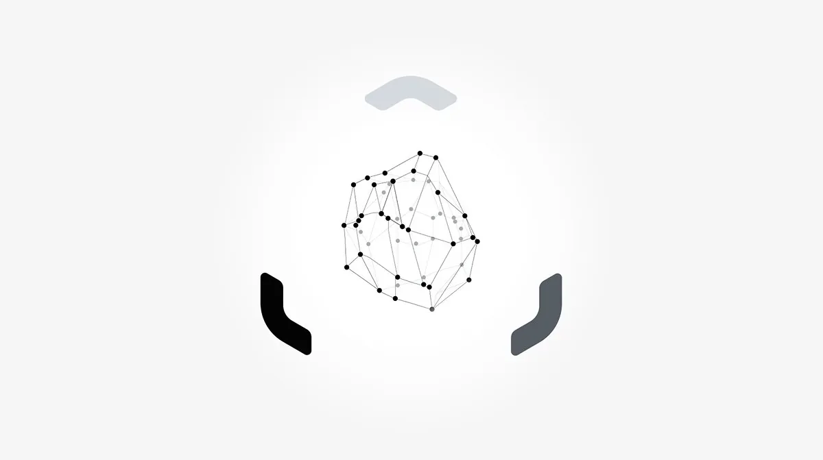
The gemstone wireframe exposes the hidden geometry that makes authentication possible. Surface to structure. Visible to invisible. The core brand narrative, visualized.
Launch video · The decisions, 3 of 3
The triplet zoom and hash generation. We go from macro (whole object) to micro (single triplet) to digital (hashcode). It compresses the entire authentication journey into seconds.
The rapid messaging. Four statements hit fast because they need to. This isn't a contemplative brand film: it's a demonstration of speed and certainty.
Sound design. Every cut, scan, and number has an associative audio track, because the technology operates across multiple dimensions. Sound helps making the invisible tangible.

The philosophy
At T-R-I, we believe there are countless ways to tell a story. For Tachyon, we needed a unique synthesis: logo reveal meets technology explainer meets brand manifesto. Need any help on similar projects of yours? Book a free consultation with us and get a quote.
© 2026 TRI NET LLC
Version 2.8.0 · "Open Recent"
All case study images are actual project materials. The autosave indicator is decorative but emotionally load-bearing. © 2026 TRI NET LLC.