
Opening Zerocool_DocSystem_v6_final_final.key…
TRI Presenter
2.8.0
Auditing what already existed
We started by collecting everything currently in circulation and putting it on a single board. The estimate had a dark header band. The schedule had none. The invoice used the full-colour logo at one size, the call sheet used no logo at all. Individually, none of these files was a problem. It was only seeing all six together, which nobody had ever had reason to do, that showed how much they varied.
The audit told us something more useful: the opportunity was structural rather than aesthetic. Each document has a job (persuade, schedule, bill), and each job wants a different layout. A schedule needs scanability. A proposal needs narrative. An invoice needs unambiguous numbers.
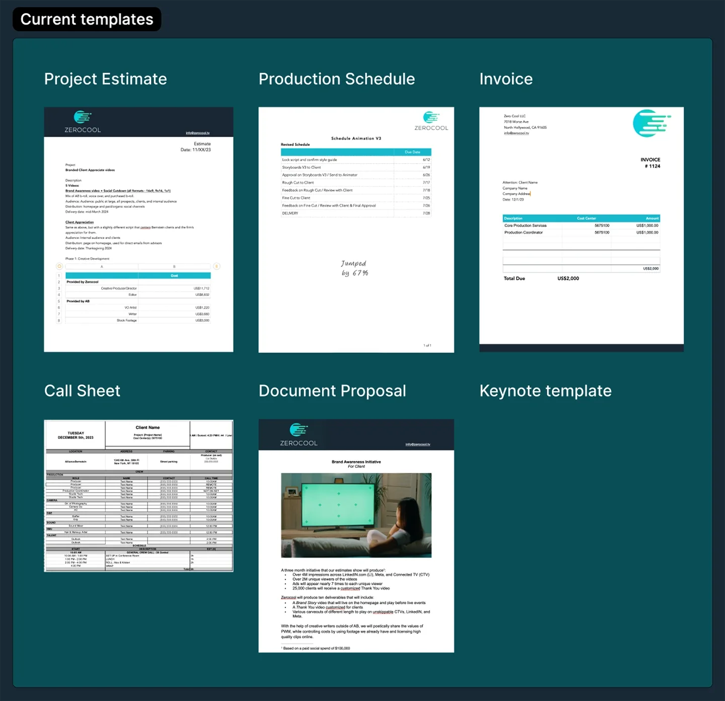 everything in circulation, one board
Building the foundation
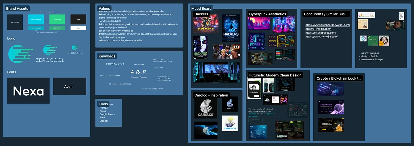 the brand, assembled in one place
We pulled together the colour set (Midnight Blue, Neon Turquoise, Digital Mint), the logo lockups at three scales, and the typefaces, Nexa for display and Avenir for text. Alongside that we captured the things that usually go undocumented: the company's values, its keywords, its actual vocabulary. "Always Be Producing." "Process is as important as story."
Dark backgrounds for presenting, light backgrounds for documenting. Keynote gets the atmosphere. Pages gets the clarity.
Presentation · Designing for the room
The Keynote template runs on Midnight Blue, with turquoise and mint carrying hierarchy. The recurring device is a bracket: corner marks that frame images, statistics and pull quotes. It lets a statistic sit on the slide as an object rather than floating text, and it scales from a 4M+ impression figure down to a footnote without changing character.
We built layouts around the presentations Zerocool actually gives, including a full-bleed statement slide for the mission line, because every pitch has a moment where you stop showing and start saying, and it deserved a layout rather than an improvised text box.
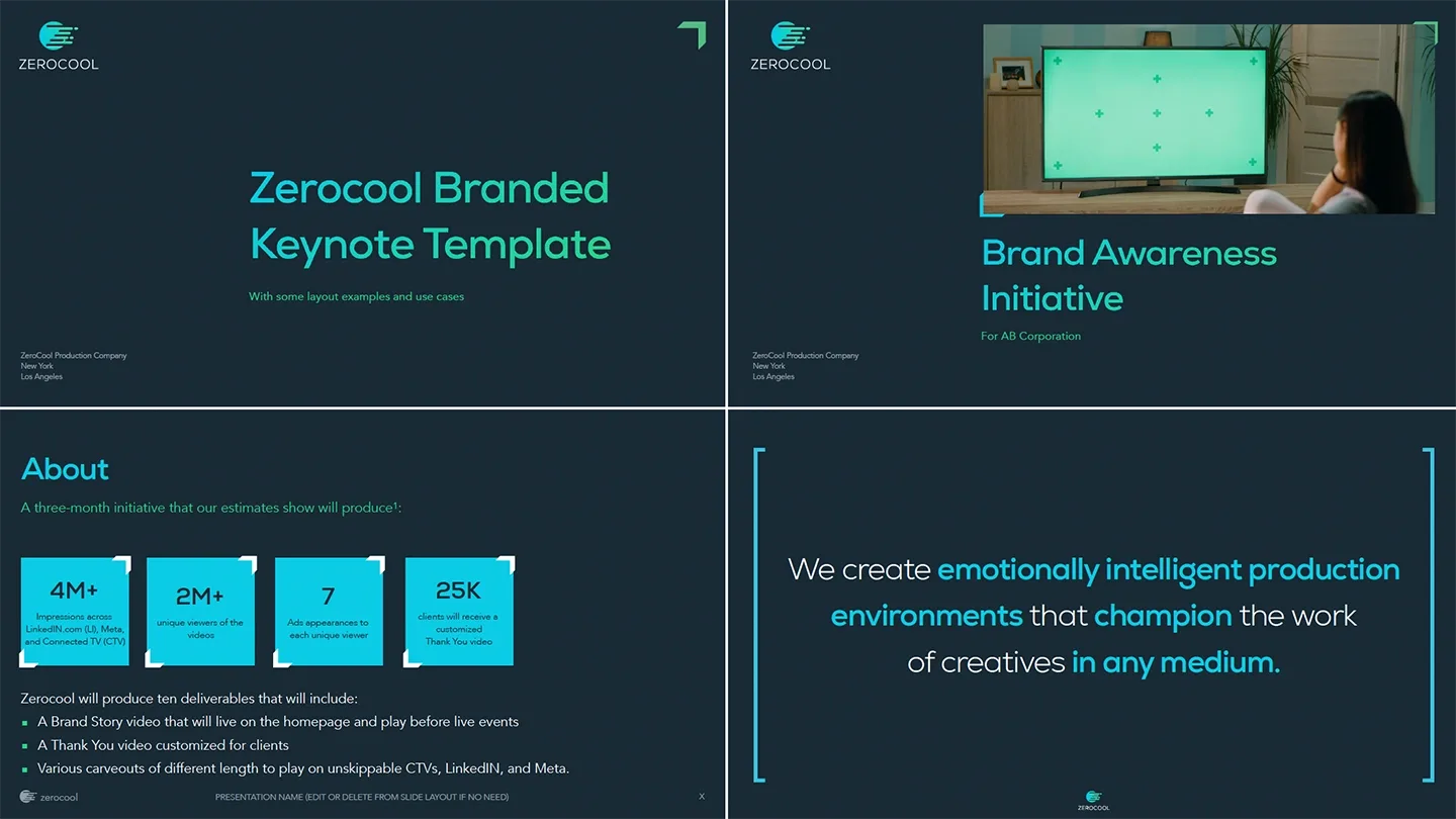 keynote · designed for the room
Documents · Designing for the desk
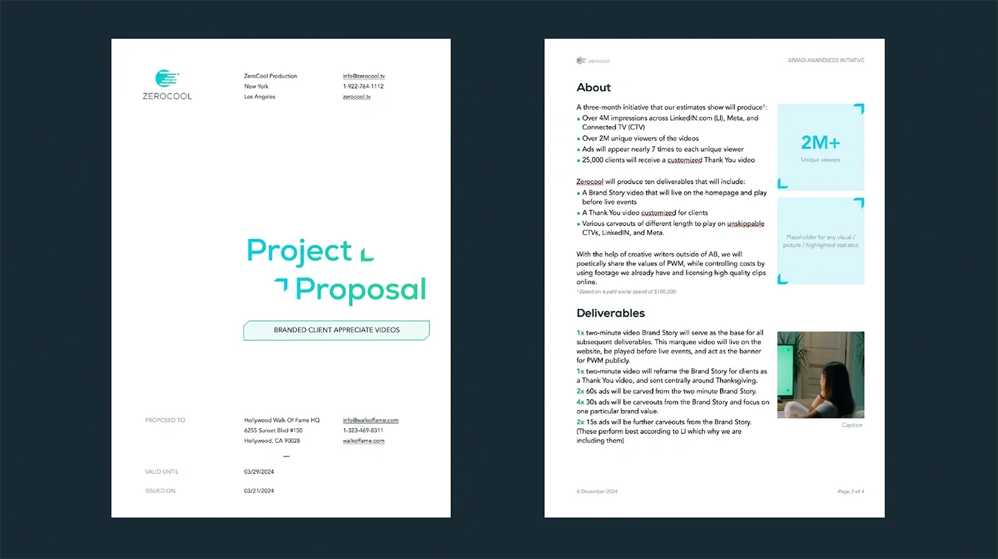 pages · designed for the desk
The proposal cover uses a three-part grid that breaks the page deliberately: sender block top, title in the optical centre with the gradient wordmark and its arrow motif, recipient and dates anchored bottom.
Inside, we solved the wall-of-bullets problem by giving statistics their own column. The 2M+ figure and the visual placeholder sit in a right-hand rail while the argument runs down the left. The reader can take either path and arrive at the same place.
Documents · The strictest treatment
Alternating row tints instead of gridlines. Column headers in mint italic caps. The delivery date in turquoise at the bottom of the schedule, isolated, because that is the one line anybody is looking for.
On the invoice, the total sits in its own tinted block, and every other number gets out of its way.
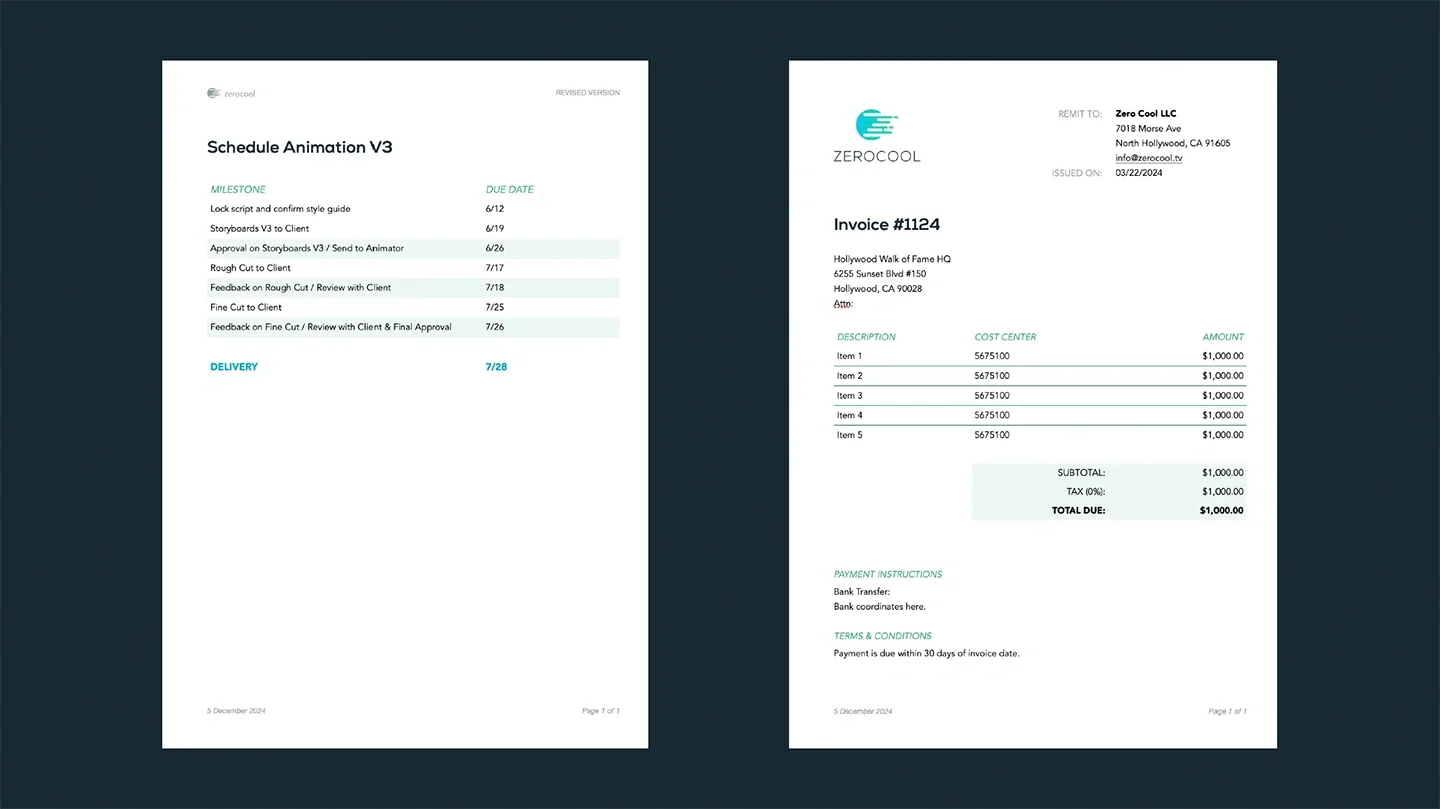 schedules & invoices
Writing it down
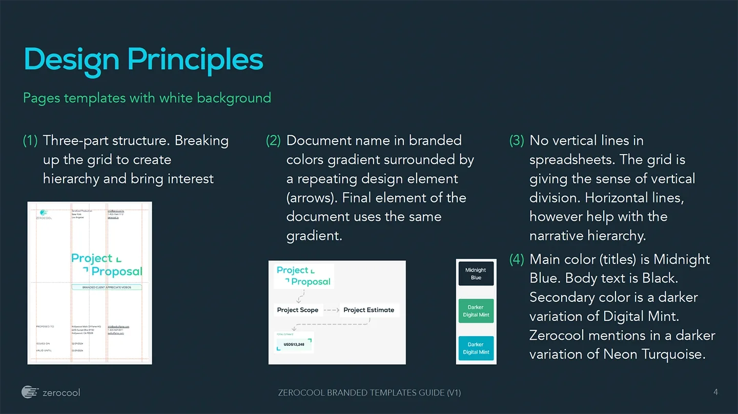 the guide
Four of them for the light-background templates: the three-part grid structure that creates hierarchy; document titles set in the branded gradient and framed by the arrow motif; no vertical lines in spreadsheets, since the grid already implies vertical division while horizontal lines support the narrative; and a fixed colour logic where Midnight Blue carries titles and black carries body.
A rule that has to be looked up will not be followed. A rule that can be remembered after one reading will be.
What we took from it
A client interacts with the invoice, the schedule and the call sheet far more often than they interact with anything on the homepage, and those documents are where a company's actual habits show. They were the ones nobody had touched, so they were the ones with the most room to improve.
© 2026 TRI NET LLC
Version 2.8.0 · "Open Recent"
All case study images are actual project materials. The autosave indicator is decorative but emotionally load-bearing. © 2026 TRI NET LLC.