
Opening VistasRathmore_Case_v3_approved.key…
TRI Presenter
2.8.0
The starting point
Vistas Rathmore is a construction consultancy operating across the GCC, born from the deliberate merger of Rathmore Consulting's decades of frontline expertise in project delivery, claims, and disputes with Vistas Global's technology capabilities. A company with a serious track record and a new chapter ahead, entering the market under a unified identity with the ambition to match.
We worked in close partnership with Mel Awasi and the leadership team throughout, from the earliest strategic conversations to the final deployed assets. Our role at T-R-I was to take that foundation and construct the complete visual system on top of it: design language, asset library, and a live website in Webflow.
Vistas Rathmore Website → the live website
Strategy into system
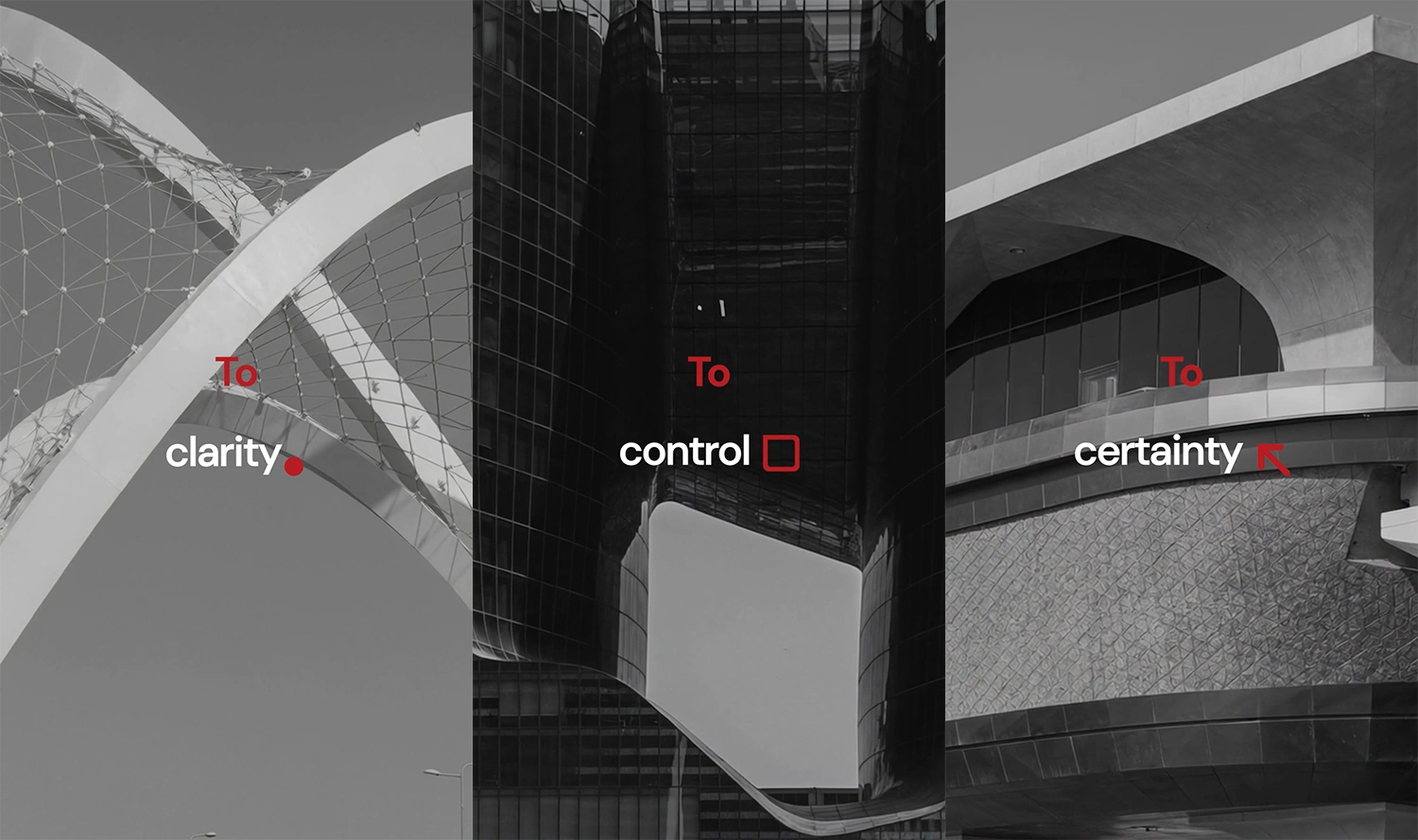 three primitives, extracted
The three graphical forms extracted from the logo operate across every touchpoint. Used in layouts as structural anchors, in the logo motto as visual punctuation, and in motion as compositional elements, they spell out the brand's promise without requiring a line of copy.
The system is self-referential by design. When you understand the brand, you understand the mark. And when you see the mark, you already know what the brand stands for.
The Adaptive Card
The centrepiece of the visual identity is what we developed as the Adaptive Card: a structural container governing every layout, grid, and composition across the brand. Its defining rule mirrors the geometry of the logo itself.
The tension between sharpness and fluidity is deliberate. Precision and adaptability, held in the same form.
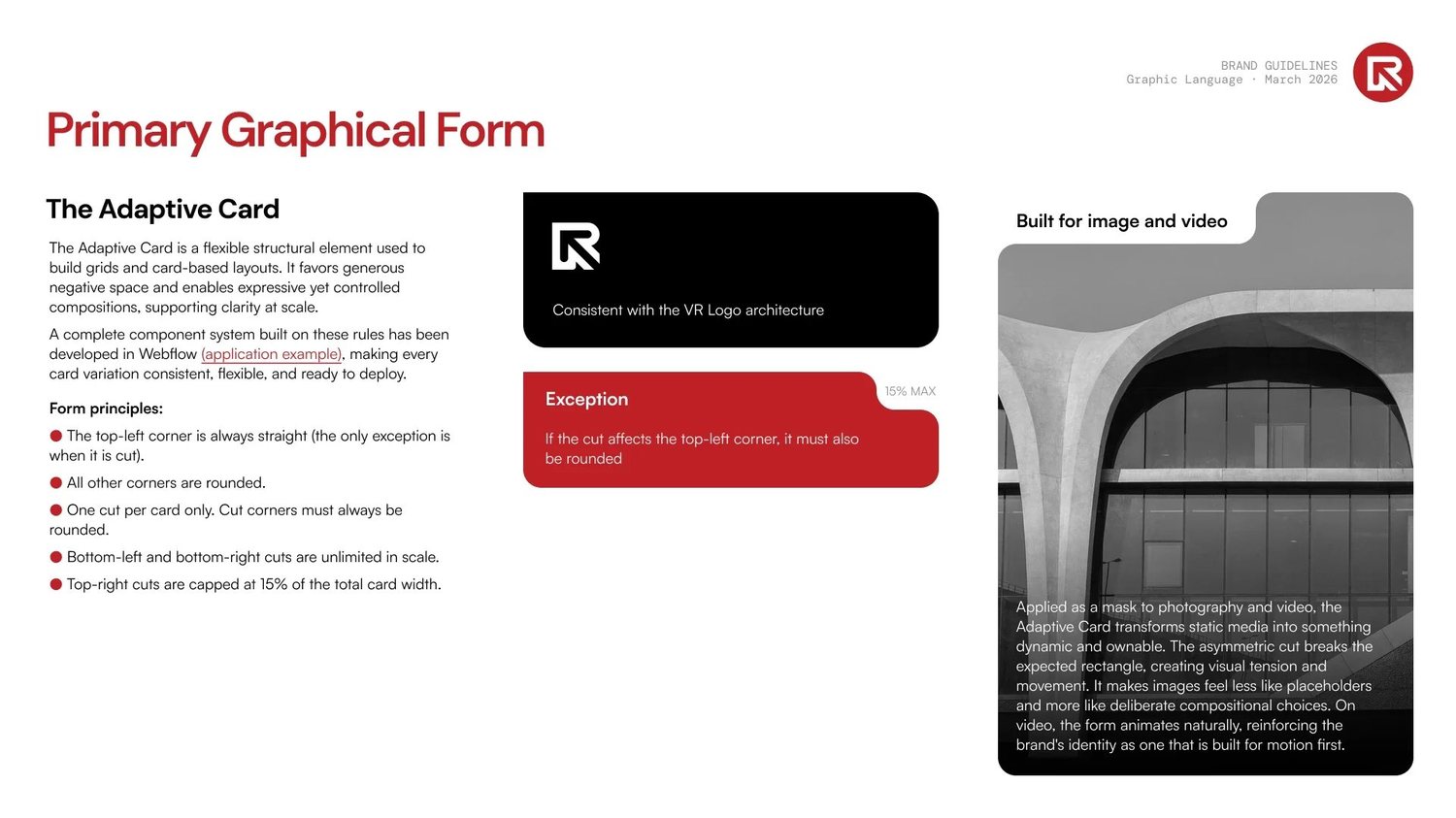 the adaptive card
Colour, handled with restraint
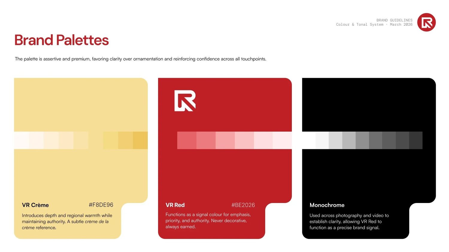 vr red #BE2026 · vr crème #F8DE96
VR Red (#BE2026) functions as a signal, never decoration. It appears where attention is required and nowhere else. Photography and video run in monochrome, with VR Crème (#F8DE96), a tone drawn from desert landscapes and Gulf identity, providing warmth and regional grounding without leaning on cliché.
The palette is assertive without being cold, premium without being distant.
Motion as the primary medium
We designed the brand as motion-first from the outset. In an industry where most competitors produce static PDFs and templated presentations, we built an identity that lives first in video and interactive formats. The photography and video system operates across four registers: abstract wave backgrounds in the VR Crème palette, high-contrast monochrome portraits shot from a low upward angle to convey authority, technology imagery combining black-and-white architecture with VR Red digital overlays and wireframes, and architectural detail shots isolating a single defining element from a structure.
Statement videos sit at the highest expression of the brand. Full-screen monochrome imagery cut at pace against driving music, with short declarative text overlays in DM Sans Bold. Every frame earns its place. Nothing explains. Everything asserts.
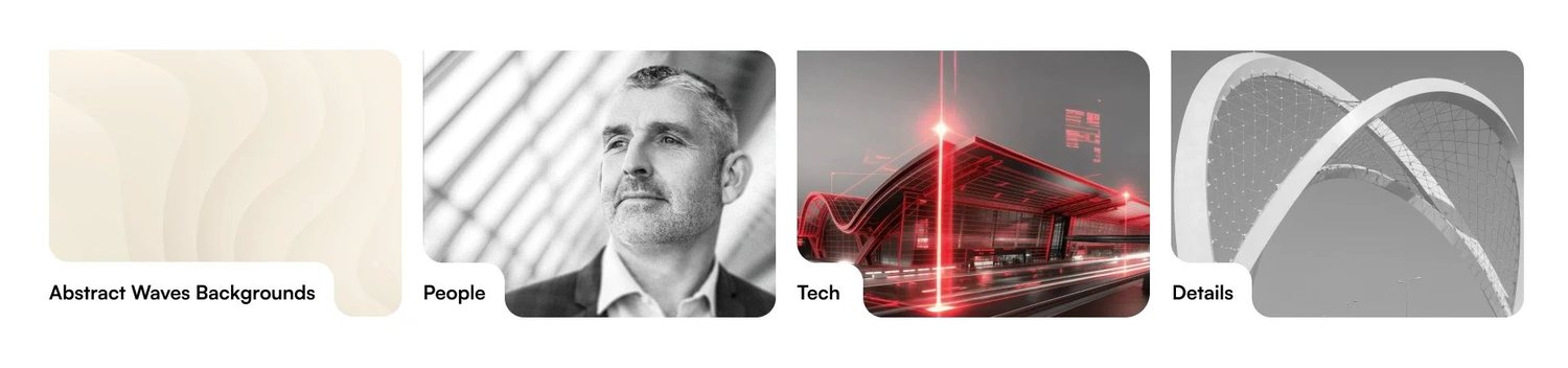 four registers, one internal logic
The results register · A detail worth recognising
Rather than showing landmark projects in full, the guiding principle was to get as close as possible: a single surface, a structural joint, a repeating facade element. Close enough that the building becomes abstract to an unfamiliar eye, but immediately recognisable to anyone who knows the work.
Showing projects at a distance risks making them look like stock imagery. Showing them as intimate, high-contrast details signals something different: these are places where the team was genuinely present, at every level of the work.
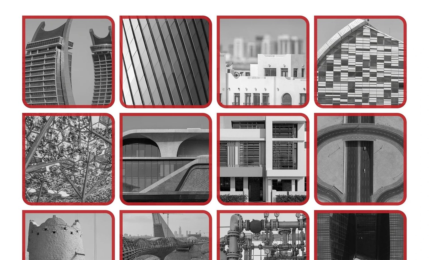 the details register
What this kind of work actually requires
The system can be handed to any designer, developer, or marketing team and extended faithfully, because confidence in a brand comes from knowing exactly why it is the way it is. If you are building something that needs to work at scale, get in touch.
© 2026 TRI NET LLC
Version 2.8.0 · "Open Recent"
All case study images are actual project materials. The autosave indicator is decorative but emotionally load-bearing. © 2026 TRI NET LLC.